Latest Posts
Book Reviews
Petit guide de survie en belgique fédérale
The Metamorphosis
La démocratie des crédules
La crise: des subprimes au séisme financier planétaire
L'implosion: la finance contre l'économie, ce que révèle et annonce la
Aftershock: The Next Economy and America's Future
You Have to Fucking Eat
Zen Mind, Beginner's Mind: Informal Talks on Zen Meditation and Practice
The Playground
Une nation nommée narcisse
Krishnamurti et l'individualisme
Croyances et imaginaires contemporains
Feet of Clay
Contribution à la critique de la philosophie du droit de Hegel
Les Fatwas de Charb, tome II: Petit traité d'intolérance
Vers une laïcité dynamique
 
Follow me on…

Entries in user interface (5)

Wednesday
Oct272010

Facebook's Meta-Likes

Since facebook came up with the idea that you can like not only things but also "actions", (e.g. while you've been able to like one person's status for a while, it only recently became possible to Like another person's commenting on that status.) the site has moved one step closer to the realm of simple-yet-impossible-to-understand webapps so recently left empty by the demise of Google Wave.

See if you can make sense of the following screencap:


What the hell is going on here ? The first line is clear enough: Cécile, Julie and Sophie like Laureline's status. (Of course they do. She's in Thailand.) The "unlike" link implies that I too apparently like her status. This begs the question of why this shows up in my news feed when I've reacted to it before and thus am obviously aware of it. But never mind: the thing that really bugs me is the last line. Apparently eight people like "this". What the hell is "this"? Are they liking Laureline's status, or Cécile's liking of Laureline's status ? (If the latter is true, Cécile has apparently gone to the trouble of liking her own liking of Laureline's status.)

At some point I thought both lists referred to the same thing, (Laureline's status) and the "4 others" were just people I wasn't friends with. But that isn't the case : clicking on "4 others" reveal a friend and 3 people I don't know. It follows that either the first and last lines are lists of people liking different things, or there is a weird reason (or bug) in facebook that explains why one of those friends is counted in the last line but not in the first.

This kind of thing has been happening all the time for the last few days. Am I the only one who is confused by this? Is there a simple and obvious explanation that I'm simply too stupid to figure out? If facebook really wants to complicate its user interface, why on Earth doesn't it provide a "dislike" button? I've been hating Florent Pagny for years, yet it's 2010 and I still have no easy way to share that feeling with the people in my life…

By publishing this, I'm taking a risk that someone might come along with a perfectly sane and simple explanation, and prove me an idiot in the comments. It's a risk I'm willing to take for three reasons: first, even in the worst case I'll actually learn something. Second, I strongly doubt that any explanation can undermine my fundamental point, which is that facebook's "like" mechanism is fucked up. Just to make the point, I'm pretty sure this is a bug :


Last but not least, as a researcher working in knowledge representation, I can't help but see a silver lining in all this: in an incredibly roundabout and unexpected way, facebook is teaching the masses one thing: reification is bloody hard.

Sunday
May232010

The Google Approach to Internationalization


I live in Brussels, Belgium, and thus every time I access any webpage, the server has a hard time guessing what language I want that page to be in. If you were the www.google.be server, here are a couple of sane ways you could make up your mind:

  • Trust the HTTP Accept-Language request header and serve the page in English.
  • Notice that the request was originally sent to google.com and serve the page in English.
  • Notice that the originating IP address is from Brussels, where 85% of residents are French-speakers, and serve the page in French.
  • If request is made during working hours, acknowledge that the user isn't especially likely to live in Brussels proper, and pick at random between Dutch, English or French.

Alternatively, you could ignore the fact that good solutions even exist, rest on the fact that 59% of Belgians speak Dutch, and use this as an opportunity to plug your browser's translation service.

Monday
Apr302007

My Very Own Mac Desktop Interface

The Mac has a great user-interface. Everybody knows that. No-one can ever explain exactly what it is that makes it so great, but it's great. Any sane person only has to use a Mac for a little while to realize how superior it is to every other GUI, even those he's never heard of or those that aren't really implemented yet. Some people may disagree, but that just means they're Windows fanboys and thus not worth listening to.

Well, call me picky, but that perfection is just not good enough for me. And judging by the number of user-interface add-ons available for Mac OS X, I'm not alone. I've tweaked my Mac so much that it doesn't even look like a Mac anymore, and that's not because the Mac is that bad. It's just that from my perspective it can still be improved quite a lot, and since there's plenty of ways to do exactly that, I did it.

First thing first: the Dock sucks. Interaction design guru Tog wrote about this a while ago, and even though Tiger has improved a few things, most of his points still hold. The Dock is a low-density widget that only works well for someone who only ever uses the same five apps and three documents, and that's not me.

The other big problem is that the Mac interface is made for multi-tasking. (If you don't find that self-evident, ask yourself why the green "Zoom" button doesn't actually zoom.) That's awesome when you're working on stuff that requires multi-tasking, like blogging or reading emails or brainstorming with a bunch of people in an IM session. However it's not so great when you need to finish a boring report, especially if you're me and you have the attention span of a ferret with ADD and a caffeine addiction.

Hence after using a Mac for a couple of months, I got annoyed at some of its GUI quirks and decided to do something about it. I quickly came upon an article by Tog called Make Your Mac a Monster Machine, and since then my Mac Desktop has changed forever.

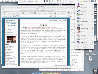
Nowadays I refuse to settle for a single user interface. I have two. The one I use most of the time is optimized for multi-tasking, just like the original Mac Desktop, and looks like this:

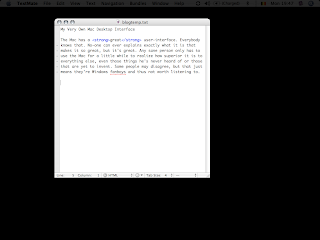
The other one I use when I need to focus on just one thing. It looks like this:

Unless you've tried this kind of setup before it probably looks stupid, but I've found it really helps me concentrate on what's really important for the work at hand.

To achieve this setup, I use a lot of different utilities and applications. Although I use all of them, there's no reason you have to, so I've decided to simply list them all and describe what they do. I guess most people will try them one at a time and figure out whether they work for them or not. So, without further ado, here's the list:

  • VirtueDesktops: If you've used Linux recently, you probably know what virtual desktops are and how useful they can be. VirtueDesktop is a pretty good implementation of the idea, and it's free. The two features I really like is first how easy it is to bind applications, forcing them to always stay on the desktop where they make the most sense (I've got Mail, iCal and Address Book bound to my "In" desktop.) and the wealth of keyboard and mouse triggers you can set up to go from one desktop to another or move applications around. This will likely be replaced by Spaces once Leopard comes out.

  • QuickSilver: This thing is unbelievably cool. The first time you use it it looks like Just Another Application Launcher: hit ⌃-space, iTunes, ↩ and iTunes appears. That's already pretty useful if you're a keyboard junkie, but when it comes to Quicksilver, launching is not so much scratching the surface as polishing it with a soft cloth. From its minimalist interface, Quicksilver allows you to open documents with any app, navigate the filesystem, create folders, move and copy files. It also comes with a wealth of plug-ins that allows for FTP upload, controlling iTunes, creating iCal appointments, reading your address book, searching Google, and pretty much everything you can think off, all in just a few keystrokes. After using it for a few days, you won't believe how you ever managed without it.


Most "power-users" think the mouse is inherently inefficient and that you can be a lot faster with keyboard shortcuts. This is mostly true, but for some tasks the mouse feels a lot more natural, and with a well-designed interface it can be mighty fast, too. The next four utilities make launching and switching between applications with a mouse much faster.

  • DragThing: This is a bit like the dock, except it is better in all possible ways. It can store hundreds of applications, documents or urls in a fraction of the Dock's footprint. Best of all, it puts them in predictable places, which makes finding them with a mouse a lot faster. As an added bonus, you get a nice trash can in the bottom right corner of the screen, which is a lot faster to access than the dock's.

  • Application Switcher Menu: This is just like the Applications menu from OS 9. It sits in the top right corner corner of your screen and shows all your open applications. With a single click you can switch to an app, quit it or hide it, without ever touching the keyboard. It's especially useful with VirtueDesktop, since Expose only shows Apps from the current desktop.

  • WindowShadeX: This is another haxie that revives a nice feature of OS9. It gives two new behaviours to all your windows: WindowShade, which rolls up the window inside it's title bar, and minimize-in-place, which shrinks it on the side of your desktop. Both are very handy when you have many windows open on a small screen.

  • StickyWindows: I found out about this one only a few days ago, and I'm starting to like it even though it's a bit redundant with WindowShade. It allows you to minimize windows into tabs and "stick" them on you screen's edges. By default these tabs are "automatic", meaning that whenever a stuck windows looses focus it minimizes to its tab, keeping screen clutter to a minimum.

Just a small hint: if you install the previous four applications, you'll quickly notice that you never use the dock anymore and it's just taking space there for no reason. Luckily, it can be totally hidden from view, even though the feature isn't well-documented. Just open up a terminal window and type these commands:

$ defaults write com.apple.dock launchanim -bool no
$ defaults write com.apple.dock magnification -bool no
$ defaults write com.apple.dock autohide -bool yes
$ defaults write com.apple.dock orientation -string top
$ defaults write com.apple.dock pinning -string end
$ defaults write com.apple.dock tilesize -int 16

then either log out and log back in or just force-quit the Finder. The dock is now hidden in the top-right corner, beneath the menu bar. If at one point you really need to see it again, hit ⌘⌥D. More info here. (By the way, don't you love operating systems that you can easily customize using undocumented NeXTStep commands that Just Works? Never mind...)

This takes care of my multi-tasking desktops. As said earlier, I also have a "single-tasking" (aka sensory-deprived) desktop, inspired by the distracted mac from the Macbreak podcast. This uses two more utilities:

  • Backdrop: This just displays a uniform wallpaper above your desktop, hiding all your icons and other applications. Originally it was made for taking nice screenshots, but it works great as a focusing aid for the attention-challenged.

  • MenuShade: Okay, you've got Backdrop running and your whole desktop is hidden. Suddenly that menu bar on top of the screen looks really bright and it's kinda annoying. MenuShade allows you to dim it, either totally black or totally bright or anything in between. When you hover your mouse near the top it reverts to full brightness for best legibility. I set it to not quite black, so that when I'm looking at it I can still aim for the right menu, but the rest of the time it simply disappears.

I've added those last two utilities to my Login Items, so they launch automatically when I turn the computer on. Using VirtueDesktop, I've bound them to my third desktop, which is called "Work in Progress". This way I always get the same setup when I log in, with the usual interface, and when I need to concentrate on something, the sensory-deprived desktop is only a keystroke away.

This is it! A super-powerful user-interface explained in just a dozen paragraphs! Don't you wish everything was that simple ?

Wednesday
Mar142007

The Macintosh Keyboard

I've just noticed that I've been writing this blog for a few months now, and I've never posted a proper tech rant. A "tech rant" is when a blogger gets up on a metaphorical podium with a decent piece of design or technology that millions of people use everyday without hassle, and tell those millions of people what a stinkin' piece of crap they've been unknowingly stuck with all this time. It's fun.

Our subject of the day will be: the Macintosh keyboard. I know, it won a gazillion prizes for industrial design, it's the main human-interaction device for the most user-friendly OS in existence, it has a wonderful soft-touch feel, and it's on display in the San Francisco Museum of Modern Art.

Well, it stinks.

First, there's a bunch of symbols missing. I can empathize with the designer's wish for a clean and pure layout, and it looks awesome in photographs, but googling "mac special characters" when you forget that ~ on an AZERTY keyboard is ⌥-n-space gets old real quick. Of course everybody knows that tilde is mostly used in spanish for the letter 'ñ', so that makes the ⌥-n-space shortcut really intuitive.

Speaking of intuitiveness, what kind of sick deranged mind ever came up with the idea of Glyph Notation ? In case you don't know, glyph notation is the amusing practice of referring to special keys (in menus, documentation, even help files) not by the key's name (conveniently written on the key itself) but with symbols that have absolutely no relation whatsoever with the key's name/shape/form/usage/history. For example, esc is ⎋, ctrl is ⌃, the option key (you know, the key with "alt" written on it) is ⌥ and the command key is ⌘, which surprisingly is drawn on the key, along with a hollow apple that doesn't appear anywhere else. (In case you're wondering: no, "command" isn't written anywhere on the keyboard.) Even though I get a real kick out of having a key with a hollow apple drawn on it, because it's cute and reminds me of the Apple IIc that introduced me to computing twenty years ago, I must admit that it doesn't make any kind of sense.

And don't get me started on "enter" (⌅) and "return" (↩). There's a key with "enter" written on it, and another one with both "return" and "enter". (I believe that if I were to forget about the existence of the "enter" key I could get the same effect with fn-return, but it might be the other way around.) According to legends, old folk tales and post-it notes some guy claims to have seen on Steve Jobs' desktop, both keys have subtly different effects. I sure hope so, because they're taking up valuable keyboard real estate on my PowerBook G4, which is so small and optimized that it doesn't even have "insert" or "delete" keys. Very sad, considering "insert" has the outstanding quality that at least I know what the hell it's for.

Despite all those non-sensical gotchas in what I'll call (for lack of a better word), the "design" of the Mac Keyboard, Mac fans seem to love it. Self-described power users even brag about how much more powerful their keyboard shortcuts are because there's four modifier keys on a Mac.

People who don't use both platforms regularly might not be aware of the subtle differences between them, so allow me to explain. Disclaimer: reading the following paragraph might cause your brain to give up on you and move to Ecuador in search of better climate and a less life-deprived body. You've been warned.

PCs don't have the ctrl (⌃) key. I mean, yeah, they have the Ctrl key, (note the capital "C") but their Ctrl key is really the equivalent of the command (⌘) key, not ctrl (⌃). So Windows PCs have three modifier keys (Ctrl, Alt, Shift) and Macs have four (cmd, alt, ctrl, shift). Now I know some of you annoying smart asses are going to tell me that PCs have the AltGr key — which Macs don't have — but this doesn't really count, because AltGr is really Ctrl+Alt, so it's not an independent key. [Update: Windows developer Deadly Smurf points out that it's possible for an application to distinguish between AltGr and Ctrl+Alt, although very few ever do, and having different behaviour in the two cases is generally considered bad design.] There's also the Windows key, but this is reserved for the OS (or seems to be. I've never seen it used by a client application) and is a joke anyway, the product of an underused mind somewhere at Microsoft, who one day looked at the space between "Ctrl" and "Alt" and thought "What a waste. Let's replace this useless empty space with a useless key, and make it do vaguely useful things in Windows 95". He brought it up to marketing, who immediately loved it, thinking that if by some off-chance the Briefcase failed to cause mass-adoption of the new OS, this "Windows key" certainly would. Last but not least, if anyone comes up with how the Mac's ctrl (⌃) is not needed on the PC because PC mouses have more than one button — on a Mac ctrl-clic gets you a right-click. Confused yet ? — I'll just have to take him outside and shoot him, because ctrl (⌃) is used in keyboard shortcuts, so it is a full-fledged modifier key.

Now where was I ? Oh, yes. Mac power users. (Am I the only one who thinks of "power users" as "people who spend so much time customizing their computer and optimizing their settings and tweaking their applications and whatever that they never use their computer to actually do anything" ? Just wondering.) So, they're bragging about those four modifier keys. As if that was obviously a good thing. As if there really was such a dire need for more key combinations.

Have you ever computed how many combinations you could get with three modifier keys ? I'm not very good at combinatorial arithmetics, but three keys should have as many states as a three bit register, which is, I think, eight. In any context where you're inputing text, using either no modifier key or Shift alone will simply input the corresponding character. And Alt is the menu key in Windows, so we're left with "only" five usable combinations for keyboard shortcuts.

The vast majority of Windows programs use Ctrl for the really obvious stuff (Save / Close / etc.) and Ctrl+Shift for the slightly less obvious stuff (Save As...), leaving three other combinations for obscure functionalities and user-defined shortcuts. As a rule, most programs don't use Alt-Shift nor Ctrl-Alt-Shift, so this means that whenever you think a function is worthy of a keyboard shortcut but Ctrl- is already taken, there's a good chance that Ctrl-Shift- or Ctrl-Alt- will be it. This is good. It means that most windows programs have very predictable keyboard shortcuts, and ease of use is all about predictability.

Now on the Mac, not only do you have four modifiers but there's no designated menu key. (It's ctrl-F2. Which means ctrl-fn-F2 on laptops. Apple obviously thinks Mac OS' menu bar's mouse implementation is so fast that there's no reason to ever use the keyboard. Amazingly this is mostly true.) This gives you fourteen possible combinations for every key on the keyboard. Which is very impressive until you realize that you effectively have zero chance of ever guessing a keyboard shortcut you've not seen before.

What compounds the problem is that beyond the really obvious (New/Open/Save/Close/Quit and clipboard ops) there's almost no convention for keyboard shortcuts across applications. Even really basic stuff like "move caret to beginning of current line" (the "caret" is the blinking vertical line that shows where you currently are in a document) can be either home or ⌘←. Move to next window/tab is either ⌘˜ (on US keyboards), ⌘> (on many other keyboards), ⌘→, ⌥⇥, ⌘⌥→
or nothing (which means either use the mouse or ⌃F2, W, ↑, something).

Things don't have to be this way: application developers could just follow best practices and standardize on something sensible. "Sensible" doesn't mean "the best design possible in a world where no other application exists", but "the design which will make our application easiest to use for our target audience, given what programs they've used in the past and the habits they've acquired in so doing."

Until this becomes widespread practice, user interface on the Mac will be a far cry from the total perfection described by fans.

Saturday
Jan272007

The open-source Aeroqua

DailyMotion hosts a cool demo of Beryl, an upcoming window manager for Linux. It borrows liberally from Aqua, Aero and Looking Glass, and adds a touch of open-source exuberance, going ridiculously overboard with themes and 2D or 3D effects.

Provided there's an easy way of disabling the more epilepsy-inducing animations, it does seems like Linux will soon be getting a top-notch window manager of its own.